 About
About
Steve's blog,
The Words of the Sledge
steve@einval.com
Subscribe
Subscribe to the RSS feed.
Links
Friends

Friday, 12 May 2017
When you're giving a presentation, the choice of font can matter a lot. Not just in terms of how pretty your slides look, but also in terms of whether the data you're presenting is actually properly legible. Unfortunately, far too many fonts are appallingly bad if you're trying to tell certain characters apart. Imagine if you're at the back of a room, trying to read information on a slide that's (typically) too small and (if you're unlucky) the presenter's speech is also unclear to you (noisy room, bad audio, different language). A good clear font is really important here.
To illustrate the problem, I've picked a few fonts available in Google Slides. I've written the characters "1lIoO0" (that's one, lower case L, upper case I, lower case o, upper case O, zero) in each of those fonts. Some of the sans-serif fonts in particular are comically bad for trying to distinguish between these characters.
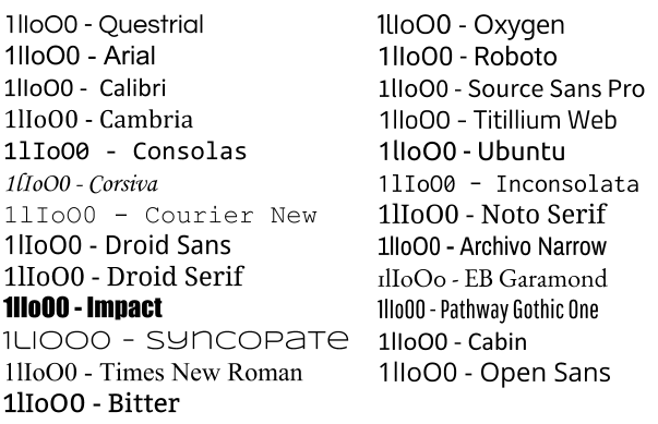
It may not matter in all cases if your audience can read all the characters on your slides and tell them apart, put if you're trying to present scientific or numeric results it's critical. Please consider that before looking for a pretty font.
23:08 :: # :: /misc :: 2 comments
Comments
|
Re: Fonts and presentations mirabilos wrote on Mon, 15 May 2017 12:09 |
|
Note that Inconsolata has stylistic sets, and one of them provides better distinguishable “l†shapes. Since virtually no software supports OpenType GSUB SS0x stylistic sets, I’ve merged them into the default and provided the fonts (renamed, as per OFL) here: - http://mirsolutions.de/dump/Inconsolatazi4varl_qu-Bold.otf - http://mirsolutions.de/dump/Inconsolatazi4varl_qu-Regular.otf - http://mirsolutions.de/dump/Inconsolatazi4varl_qu.LICENCE Reply |
Your Comment